
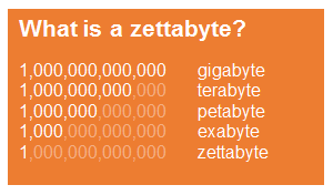
The International Data Corporation (IDC) estimate that data stored around the world will reach 40 zettabytes by 2020, a number that is fifty times as large as that recorded in 2010. To put this number into perspective, you would need over 328 trillion 128 GB iPhones to store all that information. Stacked up, they would be just about 2 times larger than the diameter of the sun.
This sort of shock-and-awe scale comparison has been common in statistics centred blog posts since the coining of the term ‘Big Data’. The trouble is that other than knowing it is pretty huge, the size of the sun is pretty incomprehensible to you and me. This isn’t ‘data visualisation’.
 However, the point is still valid, as the number is just that – pretty huge. Firms have sprung up almost overnight with the sole USP of data handling and cleaning, taking unstructured output and putting it into relational databases. It takes further cleaning and aggregation to get to a stage where data can be modelled or regressions performed. Generally, this is where the data scientist steps in.
Let’s imagine that your company has joined the data science bandwagon and, after sifting through countless CVs, employed a highly trained graduate or post graduate with journal publications to their name and a string of recommendations from their references. This doesn’t guarantee that you’ll be able to understand anything they say or show you.
With years of academia under their belt, they rarely speak to an audience that has a real or vested interest in their work, but can’t access their very specific toolset. This is a fair request, and one that is highly paid. If you go into a restaurant, you don’t go to the kitchen and interact with the chef, you just order, wait and eat the food. It should be, out of necessity, the same with data science. This is where data visualisation can help.
Approximately 65% of people are visual learners, and the brain can process visual information 60,000 times faster than text. Data visualisation is equivalent to visual communication. It refers to the techniques that are used to encode data into graphics. The goal is to communicate the required information as effectively and quickly as possible, without the need for complex debate.
To give an example, let’s narrow things down to the topic of online retail. Wouldn’t it be helpful to know which keywords or products are most valuable, and at what times? It is easy enough to pull out a slice of this; just generate a report from your favourite provider and include your efficiency measure. However, this tells you very little about any possible trends in the data – are certain keywords declining in their efficiency? What does this mean for the budget ahead? Should you invest more or less?
Why not plot these as a line or scatter plot; surely this will tell you all you need to know? Well, yes, and often this sort of plot is what a data scientist or statistician will look at themselves, performing trend analysis (regression) to get to actionable numbers that can formulate a budget from the most granular level up. But generally, you, the client or employer, don’t have time to stare at hundreds (or thousands) of line graphs. Far from communicating the benefit and reinforcing the significance, these methods often lead to disinterest and boredom.
An entirely more effective visualisation is the streamgraph, a type of stacked area graph, popularised by Lee Byron and their use in a 2008 New York Times article on movie box office revenues. In the below example we can see that as a time of overall revenue growth occurs, one or two keywords are dominating and displaying a continued growth trend. It gives a very intuitive interpretation, showing both the trend of individual keywords and their share of the whole.
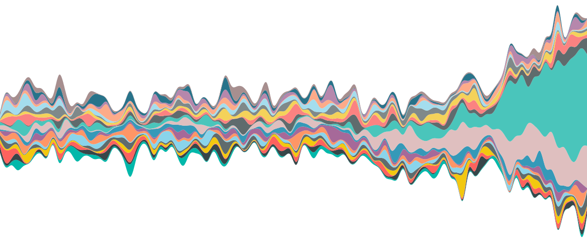
An example of a streamgraph, showing revenue growth over time for various keywords.
For another example let’s imagine that you have a parent company with various brands and want to understand the performance of each brand and which channels are resulting in the most traffic. Commonly, this is displayed in a table (or at best a bar chart). Converting this to percentages of a whole share would help to understand the relationships. However, fractions and percentages often only serve to further confuse, and require further explanation. Parallel sets supply an alternative. The below displays the relationships between several brands and multiple channels quickly, without the need for further explanation. Ordered from left to right by size, we can see which brands and channels perform the best overall and the individual weightings between brand and channel.
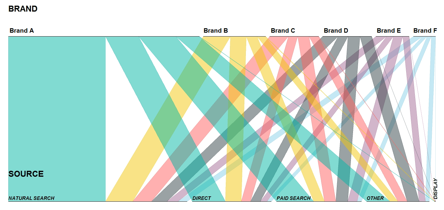
Parallel sets displaying the relationships between Brands and Traffic Sources.
However, with this new found ability to wow the man upstairs left, right and centre, comes added responsibility. Often the simple bar chart is the best choice, and ‘pretty for pretty’s sake’ can be detrimental to the information that we are trying to convey. It is this informed restraint that results in tangeable, actionable insights which should always be the main purpose of any reporting.